What These ChatGPT Prompts Can Do
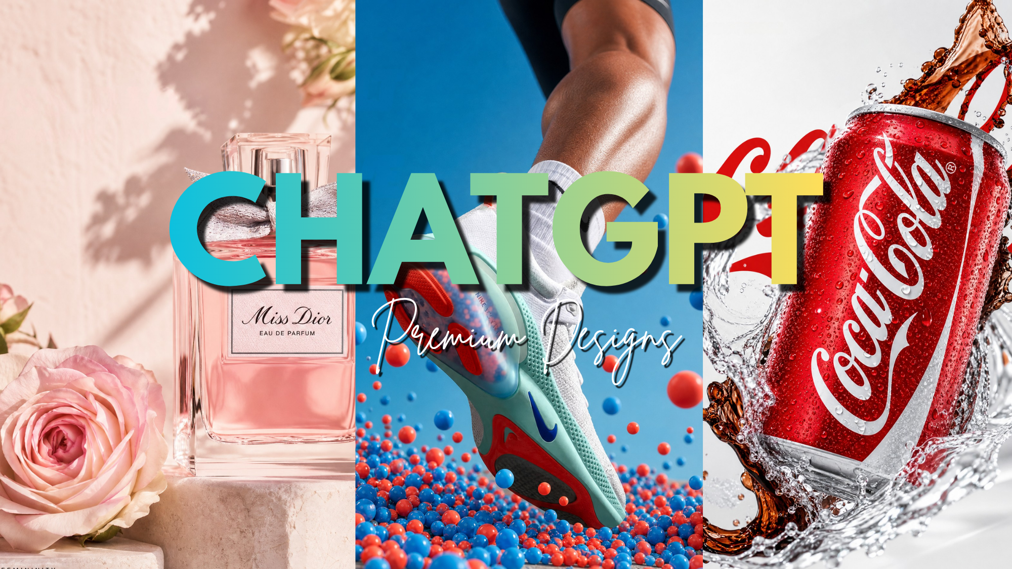
ChatGPT Design Prompts can turn a simple product idea into a detailed creative direction for a premium social media advertisement. Instead of asking AI to simply “make an ad,” you can specify the composition, lighting, typography, product placement, visual hierarchy, colors, and overall style.
With the right ChatGPT Design Prompts, you can create concepts for food advertisements, beverage campaigns, luxury product shots, promotional graphics, and complete social media campaigns without starting from a blank canvas.
ChatGPT can also generate and edit images directly, including following instructions about composition, aspect ratio, text, and visual details.
Also Read: AI Producer Just Made Manual Video Editing Optional
Here are 6 ChatGPT prompts that create premium post designs.
1. Samyang Buldak Hot Chicken Ramen
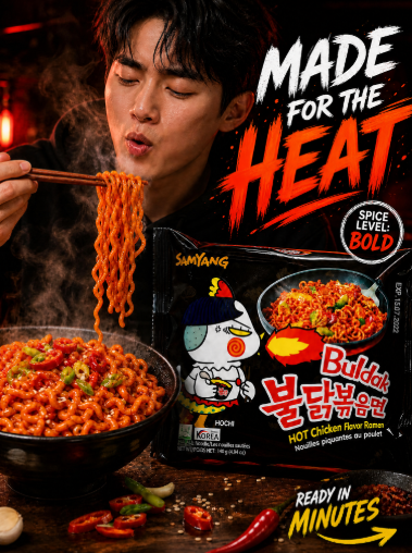
Create a premium, photorealistic commercial advertising poster for Samyang Buldak Hot Chicken Flavor Ramen. Exact canvas: 1080 × 1350 px, Instagram portrait 4:5, full-bleed finished ad.
VISUAL CONCEPT:
Build an intense, spicy Korean instant-noodle scene in a rich black, deep-red and fiery-orange environment. Use cinematic restaurant-style lighting with glowing red highlights and realistic steam rising from the noodles. The scene should communicate intense heat and deliciousness in a youthful, energetic and high-end way—not like a generic AI food image.
HERO PRODUCT:
Place a large, front-facing Buldak Hot Chicken Flavor Ramen packet in the lower-center/right foreground. Keep the packet shape, black-and-red colors, Buldak branding, typography, mascot artwork, Korean text and packaging details as accurate as possible. Make the packet crisp, realistic and physically grounded on a dark wooden serving surface.
FOOD:
Place a steaming bowl of glossy Buldak noodles in the lower-left foreground, with visible curly strands coated in rich red spicy sauce, chili flakes, sesame seeds and green onions. Add a few naturally scattered red chilies, scallions and garlic. Show a small amount of realistic steam rising from the bowl and lifted noodles to clearly communicate that the food is extremely hot.
HUMAN ELEMENT:
Behind the product, show a young Korean man with dark hair wearing a black hoodie, eating Buldak noodles with wooden chopsticks. Have him gently blow on the noodles before eating them, with slightly pursed lips and a natural expression that suggests the noodles are hot but delicious. Add subtle, thin steam rising directly from the noodles near his face. Use shallow depth of field so the face is slightly softer than the product.
COMPOSITION:
Use a strong central product hierarchy: packet first, food second, human third. Position the person and chopsticks in the upper-left/middle, the Buldak packet in the lower-center/right, and the steaming noodle bowl in the lower-left. Use the rising steam to visually connect the food and person. Keep the upper-right area clean enough for the headline and supporting typography.
TYPOGRAPHY:
Add the headline in the upper-right: “MADE FOR THE HEAT” with a bold hand-painted brush style; “HEAT” in fiery red/orange and supporting words in white. Add a small circular badge on the right reading “SERIOUSLY SPICY!” and a small bottom-right callout: “READY IN 5 MINUTES” with “5” in yellow and a hand-drawn arrow pointing toward the food.
STYLE:
Luxury Korean FMCG advertising photography, photorealistic food textures, glossy spicy sauce, realistic steam, realistic skin and hair, cinematic contrast, deep blacks, rich reds, fiery orange highlights, controlled highlights, premium commercial retouching, subtle depth of field, natural shadows and sophisticated color grading. The final result should feel like a high-budget Korean food advertisement.
IMPORTANT:
No random objects, no distorted hands, no duplicate chopsticks, no warped packaging, no altered Buldak branding, no gibberish text, no cartoon look, no plastic-looking food, no excessive smoke or flames, no exaggerated facial expression, no unnecessary decorative elements. Keep the steam subtle and realistic, make it obvious that the person is blowing on hot noodles, and keep the design clean, intentional and believable. Output only the finished poster.
2. Coca-Cola Cold Refreshment
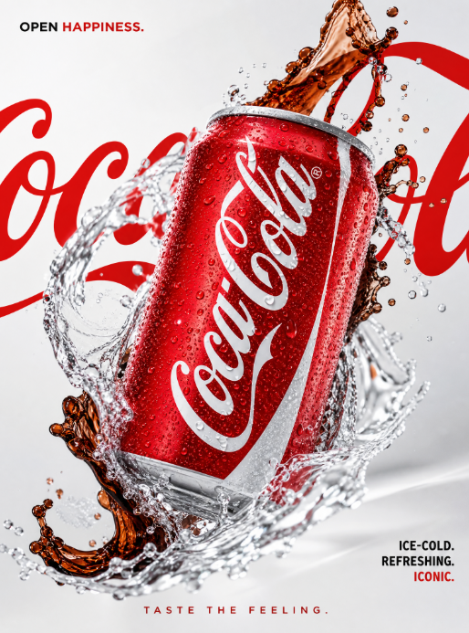
Create a premium, photorealistic Coca-Cola advertising poster inspired by high-end beverage campaign photography. Exact canvas: 1080 × 1350 px, Instagram portrait 4:5, full-bleed commercial ad.
VISUAL CONCEPT:
Create a dramatic “refreshment in motion” composition on a bright cool-white/light-grey studio background with bold Coca-Cola red accents. The visual should feel crisp, refreshing, energetic and premium, combining clean editorial art direction with the excitement of a freshly opened Coca-Cola.
HERO PRODUCT:
Feature one cold Coca-Cola Original Taste can tilted diagonally from lower-left toward upper-right, floating or suspended naturally in the center. The can must be sharply focused, metallic silver with the authentic red Coca-Cola label, covered in realistic condensation droplets, with the Coca-Cola branding clearly visible and correctly proportioned. Preserve the authentic can geometry, colors, logo treatment and packaging details.
LIQUID ACTION:
Surround the can with dynamic arcs and splashes of crystal-clear water. Water should look physically realistic, with individual droplets, refraction, highlights and natural motion. Add a subtle dark cola-colored liquid ribbon or splash flowing behind and around the can to create contrast and communicate the beverage itself, without making the scene messy.
BACKGROUND:
Minimal light-grey/white studio background with a soft gradient and subtle shadows. Use clean high-key commercial lighting with controlled Coca-Cola-red reflections and specular highlights on the can and water. Keep the background bright, refined and uncluttered.
TYPOGRAPHY:
Place oversized cropped red “Coca-Cola” script typography in the background, partially hidden behind the can and water. Add a small top-left headline: “OPEN HAPPINESS.” with “HAPPINESS.” in Coca-Cola red. Bottom-right: “ICE-COLD. REFRESHING. ICONIC.” with “ICONIC.” accented in red. Bottom-center: “TASTE THE FEELING.” in clean, elegant typography.
COMPOSITION:
Keep the Coca-Cola can as the unmistakable hero. Use strong diagonal movement from lower-left to upper-right. Allow the water and cola splash to create a sense of motion around the product while keeping the Coca-Cola logo completely visible. Leave enough negative space for typography and maintain a clean, balanced premium composition.
STYLE:
Luxury beverage campaign, high-end studio product photography, ultra-realistic condensation, physically accurate liquid splash, realistic cola texture, sharp product detail, cinematic commercial lighting, clean editorial typography, premium retouching, subtle reflections and photorealistic materials.
IMPORTANT:
No extra cans, no hands, no fruit, no random props, no distorted Coca-Cola logo, no warped typography, no incorrect packaging, no excessive effects, no exaggerated splashes, no cartoon appearance, no plastic-looking liquid, no obvious 3D-render look. Keep the Coca-Cola branding recognizable and accurate. The final image must look like a real professional global beverage advertisement.
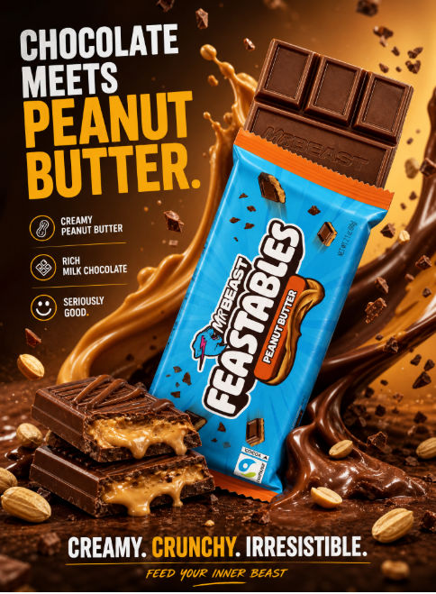
3. Feastables Chocolate Peanut Butter
Create an award-winning, premium photorealistic Feastables Chocolate Peanut Butter advertising poster. Exact canvas: 1080 × 1350 px, Instagram portrait 4:5, full-bleed commercial advertising artwork.
VISUAL CONCEPT:
Create a rich, indulgent chocolate world using a bold yellow, brown and creamy peanut-butter-toned environment with dramatic studio lighting. The mood should feel playful, delicious, modern and premium, with a youthful Feastables identity rather than a traditional luxury chocolate advertisement.
HERO PRODUCT:
Place a large Feastables Chocolate Peanut Butter chocolate bar/package diagonally in the center-right foreground. Keep the authentic packaging colors, Feastables branding, typography, Peanut Butter variant treatment and packaging details as accurate as possible. The wrapper should look realistic and premium, with part of the chocolate bar opened so several chocolate squares are clearly visible.
CHOCOLATE:
Show realistic milk-chocolate squares with soft highlights, detailed texture and a freshly broken edge. Add creamy peanut-butter filling visibly layered inside the broken chocolate. Scatter a few realistic roasted peanut pieces around the chocolate. The chocolate and peanut butter should have physically believable textures—not overly glossy or plastic-looking.
LIQUID/ACTION:
Create dramatic but controlled ribbons of melted chocolate and creamy peanut butter flowing behind and around the product. Add a few chocolate crumbs and peanut fragments suspended naturally in the air to create energy and motion. Keep the movement dynamic but clean and intentional.
TYPOGRAPHY:
Upper-left headline: “CHOCOLATE MEETS PEANUT BUTTER.” Use bold, playful modern typography with “PEANUT BUTTER” emphasized in warm yellow or creamy beige. Add a small feature stack with clean icons: “CREAMY PEANUT BUTTER”, “RICH MILK CHOCOLATE”, “SERIOUSLY GOOD.” Bottom: “CREAMY. CRUNCHY. IRRESISTIBLE.” with a small playful Feastables-inspired signature line.
COMPOSITION:
Product dominates the frame and sits slightly right of center. Leave clean negative space on the left for the headline and feature information. Use foreground peanuts, chocolate crumbs and subtle chocolate/peanut-butter motion for depth while keeping the packaging and chocolate clearly visible.
STYLE:
Premium FMCG campaign, high-end food photography, playful modern commercial aesthetic, warm yellow-and-brown lighting, hyper-real chocolate texture, realistic peanut-butter filling, physically believable liquid movement, shallow depth of field, crisp product detail, sophisticated typography and premium commercial retouching.
IMPORTANT:
No random props, no extra packages, no deformed chocolate squares, no excessive melting covering the logo, no distorted Feastables branding, no unreadable text, no fake-looking peanuts, no cartoon style, no plastic-looking chocolate, no excessive glow or clutter. Keep the packaging recognizable and accurate, the food physically believable and the entire composition intentional, modern and brand-ad quality.
4. Miss Dior Luxury Fragrance
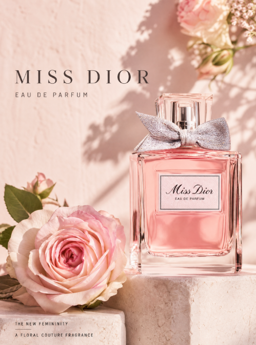
Create a luxury fragrance advertising poster for Miss Dior Eau de Parfum. Exact canvas: 1080 × 1350 px, Instagram portrait 4:5, full-bleed editorial beauty campaign.
VISUAL CONCEPT:
Create a romantic, sophisticated floral still-life with a refined Parisian luxury aesthetic. Use a soft blush-pink and warm cream environment with subtle plaster texture, delicate natural sunlight and elegant botanical shadows. The mood should feel feminine, timeless, refined and effortlessly luxurious.
HERO PRODUCT:
Place one Miss Dior Eau de Parfum fragrance bottle vertically on the right side of the composition, standing on a pale cream stone pedestal. The bottle should look elegant and photorealistic, with its recognizable transparent glass, soft pink fragrance, silver-toned cap and signature Miss Dior label and bow. Preserve the bottle proportions, label placement, glass materials, reflections and recognizable design details as accurately as possible.
BOTANICAL ELEMENTS:
Place a large fresh pink and white rose with realistic layered petals in the lower-left foreground, resting naturally near the pedestal. Add a few delicate green leaves and subtle floral stems. In the upper-right corner, include softly blurred flowers and greenery creating a refined natural frame around the bottle. Keep the botanical elements elegant and minimal.
LIGHTING:
Use warm directional sunlight entering from the upper-right/side, producing soft realistic shadows and a delicate glow through the glass bottle. Add subtle highlights along the edges of the bottle and flowers. The scene should feel photographed for a high-end Parisian fashion campaign, not artificially rendered.
TYPOGRAPHY:
Upper-left: “MISS DIOR” in elegant widely spaced high-fashion serif typography. Under it: “EAU DE PARFUM” in refined small uppercase lettering. Lower-left: “THE NEW FEMININITY” followed by a thin elegant divider line and small copy: “A FLORAL COUTURE FRAGRANCE”.
COMPOSITION:
Keep the left side quiet and spacious for typography. The Miss Dior bottle should be the primary focal point, with the rose acting as a secondary visual anchor. Position the bottle slightly right of center and use shallow depth of field on the background flowers and greenery. Maintain generous negative space and a balanced editorial composition.
STYLE:
Luxury French perfume campaign, high-end editorial product photography, soft blush and cream palette, premium glass reflections, realistic fragrance liquid, botanical macro detail, warm natural sunlight, sophisticated fashion-art direction, subtle filmic texture, shallow depth of field and minimal composition.
IMPORTANT:
No clutter, no excessive flowers, no extra bottles, no random jewelry or cosmetics, no distorted packaging, no incorrect bottle proportions, no altered Miss Dior branding, no fake luxury aesthetic, no harsh shadows, no cartoon look, no excessive pink glow. Keep the result timeless, restrained, elegant and genuinely premium.
5. Nike Running Shoe Performance
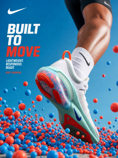
Create a premium, high-impact Nike running shoe advertising poster using the uploaded shoe image as the exact product reference. Recreate the visual style and composition of the uploaded reference while showing the shoe naturally worn by an athlete. Exact canvas: 1080 × 1350 px, Instagram portrait 4:5, full-bleed commercial advertising artwork.
VISUAL CONCEPT:
Create a dynamic, playful and high-energy product scene inspired by the uploaded reference image. Use a clean bright-blue studio environment with a soft gradient background and vibrant red and blue floating spheres surrounding the athlete’s foot. The visual should feel fresh, energetic, modern and premium.
HERO PRODUCT:
Feature the uploaded Nike shoe being worn by an athlete as the unmistakable hero. Position the foot diagonally in the center of the frame with the shoe angled toward the camera, capturing the dramatic perspective of the reference image. Preserve the exact shoe design, proportions, materials, colors, stitching, sole construction, laces and recognizable Nike Swoosh from the uploaded image. Make the shoe extremely sharp, realistic and physically believable.
ATHLETE:
Show a realistic lower leg and foot naturally wearing the uploaded shoe. Capture the athlete in a dynamic running or jumping position, with natural anatomy, realistic skin texture and believable movement. Keep the athlete’s clothing minimal and performance-oriented, such as clean athletic socks and subtle black running apparel. The body should support the product rather than compete with it, keeping the shoe as the main focal point.
DYNAMIC ELEMENTS:
Surround the athlete’s foot with dozens of small and medium red and blue glossy spheres, inspired by the reference image. Place some spheres clustered beneath and around the shoe while others float naturally at different depths and heights. Use realistic shadows, reflections and depth to make the spheres feel physically present. Keep them playful and energetic without covering important shoe details.
BACKGROUND:
Use a clean bright-blue studio background with a subtle gradient, similar to the reference image. Keep the environment minimal and uncluttered, with a soft neutral ground surface beneath the athlete and floating spheres.
LIGHTING:
Use bright high-key commercial lighting with soft natural shadows, crisp highlights and realistic reflections on the shoe and spheres. Add subtle rim lighting along the shoe and athlete’s leg to separate them from the background. The lighting should feel like premium professional sports product photography.
TYPOGRAPHY:
Place the Nike Swoosh and campaign typography naturally within the available negative space. Add a bold headline: “BUILT TO MOVE”, using clean modern typography with “MOVE” emphasized in Nike-inspired red. Add supporting copy: “LIGHTWEIGHT. RESPONSIVE. READY.” and a small product line: “NIKE RUNNING”. Keep the typography minimal and secondary to the shoe.
COMPOSITION:
Keep the uploaded shoe as the dominant focal point and closely follow the reference image’s dramatic perspective, diagonal positioning, framing, product scale and visual hierarchy. Use the athlete’s leg and foot to make the shoe feel naturally worn and presentable, while the floating spheres create depth and movement around it. Maintain a clean, balanced composition with strong foreground and background separation.
STYLE:
Premium Nike sports advertising, photorealistic action photography, vibrant studio campaign, realistic shoe and skin textures, glossy spheres, dramatic perspective, crisp product detail, soft shadows, high-key lighting, sophisticated color grading, professional commercial retouching and modern editorial art direction.
IMPORTANT:
Use the uploaded shoe image as the exact product reference. Do not redesign, replace or modify the shoe. Preserve its exact shape, proportions, colors, materials, sole design, Nike Swoosh and construction. Show the shoe naturally worn on a realistic athlete’s foot. No distorted feet, malformed legs, extra toes, unnatural anatomy, warped shoe, incorrect sole, extra shoes, floating feet, random props, excessive effects, cartoon rendering, plastic-looking materials or clutter. Keep the shoe unmistakably recognizable and make the final image look like a real professional Nike advertising campaign.
6. Tesla Model Y Electric Future
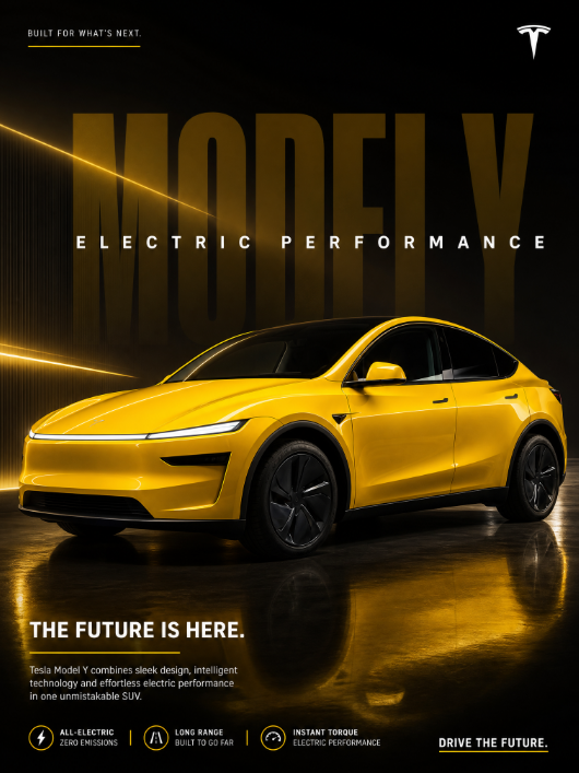
Create a premium Tesla Model Y automotive advertising poster. Exact canvas: 1080 × 1350 px, Instagram portrait 4:5, full-bleed luxury automotive campaign.
VISUAL CONCEPT:
Create a dramatic modern studio/industrial environment with a black-to-charcoal background and controlled golden-yellow lighting. The atmosphere should communicate futuristic performance, clean design, innovation and premium electric mobility.
HERO CAR:
Feature a bright yellow Tesla Model Y in a powerful low front three-quarter view. The car should dominate the lower half of the poster and face slightly toward the viewer. Preserve realistic Tesla Model Y proportions, aerodynamic body shape, sleek LED headlights, smooth front fascia, flush door handles, panoramic glass roof, black wheels, performance tires, mirrors and clean body contours. The yellow paint should look rich, glossy and physically realistic.
REFLECTIONS:
Place the car on a polished dark floor with realistic reflections beneath it. Use soft golden-yellow light streaks entering from the left to create controlled highlights across the hood, fenders, doors and roof. Add subtle reflections along the curved body panels while keeping the vehicle physically grounded.
BACKGROUND TYPOGRAPHY:
Behind the car, add an enormous subtle “MODEL Y” occupying most of the upper-middle background in elegant oversized typography. Place “ELECTRIC PERFORMANCE” in spaced white uppercase letters across the background text. Keep the typography behind the car so the vehicle remains the unmistakable hero.
BRANDING:
Top-left: small uppercase “BUILT FOR WHAT’S NEXT.” with a thin yellow line beneath. Top-right: Tesla logo. Keep the branding minimal and refined.
COPY:
Bottom-left headline: “THE FUTURE IS HERE.” followed by a thin yellow divider and short premium copy: “Tesla Model Y combines sleek design, intelligent technology and effortless electric performance in one unmistakable SUV.” Bottom specifications: “ALL-ELECTRIC / ZERO EMISSIONS”, “LONG RANGE / BUILT TO GO FAR”, “INSTANT TORQUE / ELECTRIC PERFORMANCE”. Bottom-right: “DRIVE THE FUTURE.”
STYLE:
Luxury automotive photography, photorealistic Tesla Model Y, cinematic studio lighting, razor-sharp body reflections, realistic glossy yellow paint, premium commercial retouching, dramatic low-angle perspective, sophisticated black-and-yellow color palette, clean futuristic art direction.
IMPORTANT:
No extra cars, no people, no traffic, no random props, no distorted wheels, no malformed headlights, no incorrect Tesla logo, no fake reflections, no cartoon/CGI look, no excessive smoke or lens flare. Keep the Tesla Model Y clearly recognizable, physically accurate and dominant in the composition. Keep the overall design clean, powerful, futuristic and premium.
The Bottom Line
The secret to getting better AI-generated advertisements isn’t simply asking for a “beautiful image.”
It’s giving AI enough creative direction to understand what the viewer should see first, what the product should communicate, how the scene should feel, and where every element belongs.
Read more: 8 YouTube Videos Worth Watching on Your Lunch Break
These ChatGPT prompts give you a framework for creating everything from premium food advertisements and beverage campaigns to luxury product shots and complete social media creative sets.
Save these prompts, swap in your own products, and start turning simple ideas into professional-looking ad concepts.
If you want to explore more AI tools, check our homepage. Or visit the Blog for more tutorials and tool breakdowns like this one.